

A recovery path for transfers
Manteca requires a linked account for bank transfers. When that information is missing, the flow requests it during the purchase so funds can be returned if the operation fails.
Product Design · Fintech / Web3
Overview
R3al Blocks connects people with investment opportunities linked to tokenized real-world assets. The challenge was to make a complex financial category understandable to people with different levels of familiarity with finance and Web3.
The Consumer experience needed to connect discovery, project evaluation, purchase and post-purchase management while responding to real constraints around identity, payments, custody, blockchain and financial communication.
Critical journey
Move from the brand promise to a real opportunity.
Understand the asset, conditions and documentation.
Confirm identity and request only the data required.
Choose quantity, currency and payment method.
Make the operation and its current status explicit.
Follow investments, orders, balance and movements.

Product and context
The marketplace translated the proposition into concrete opportunities without turning the experience into a crypto exchange or a speculative promise.
Before opening a project, the cards surfaced the token information needed to continue: estimated annual return, token value, total units and sold units. The hover creates a second level of information while keeping the first view focused on the products.

A concrete case
Mathienzo made the journey tangible: what the asset was, what a person needed to understand before investing and how the Web experience supported that evaluation.
The view organizes the asset, project story, token value, estimated return, payment methods and next action in one continuous experience. Context appears before conversion.
Presented as a result of the broader project and collaborative work—not as an outcome attributed exclusively to UX design.

Purchase flow
Registration and identity verification do not force people to complete every account detail upfront. The purchase flow asks for information progressively, according to the selected payment method.
Manteca requires a linked account for bank transfers. When that information is missing, the flow requests it during the purchase so funds can be returned if the operation fails.
When a payment requires currency conversion, the quote is calculated at the end of the flow. This reduces the risk of presenting an outdated amount while the person completes the previous steps.

Launching a new asset
Gold was introduced through one continuous sequence: first creating intrigue, then revealing the launch and finally leading into the product view.
It appears after the general purchase flow because its behavior is different from tokenized projects. People can review its value and market evolution, then buy or sell it from the same experience.

After the purchase
Buying is not the end of the journey. The account brings together profile information, investments, wallet activity and orders so people can understand what they own and what is happening next.
Each area answers a different post-purchase question: what was invested, which operations are still in progress, which funds are available and what action can be taken from the current state.
Operational states
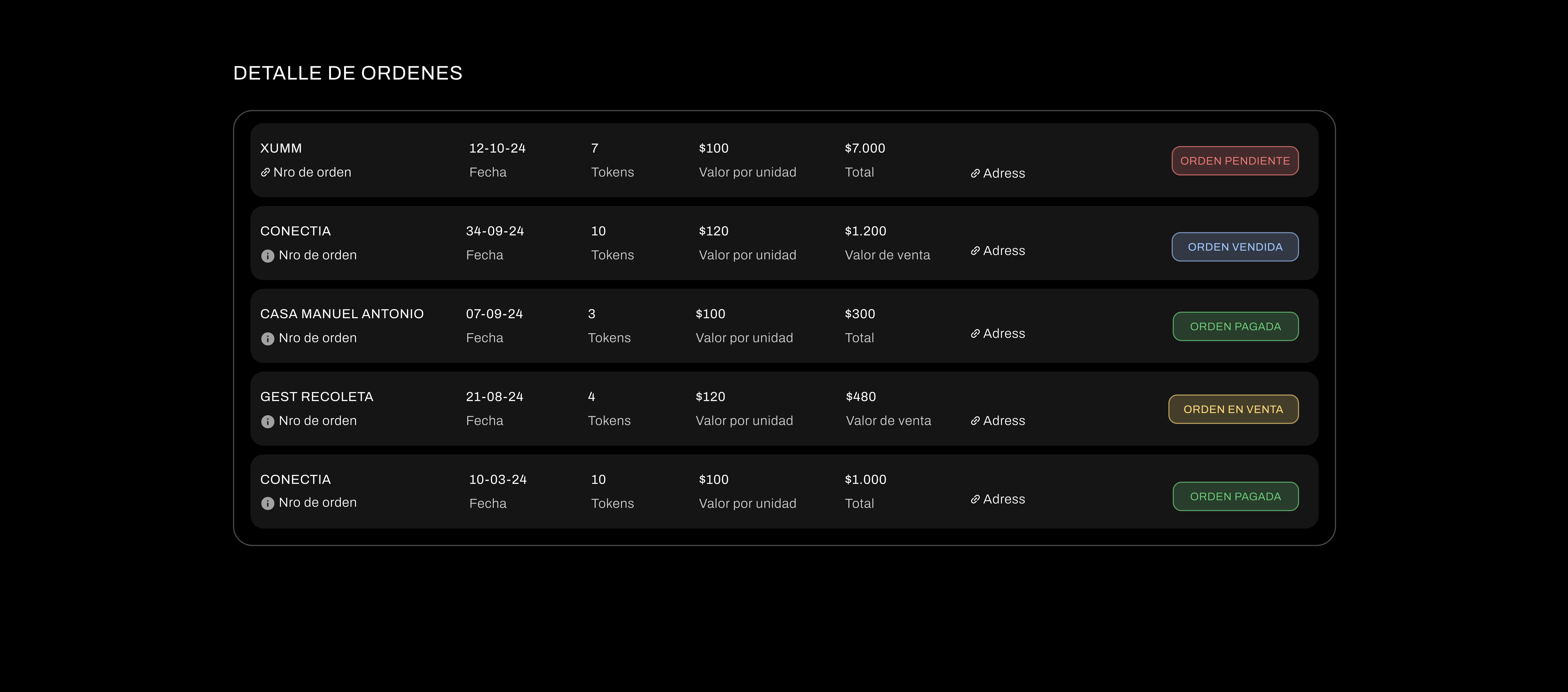
Mis órdenes makes the status of each operation visible: pending, sold, paid or on sale. The person can understand what happened without reopening the entire flow.

Product and development
Identity validation, payment providers, bank transfers, currency conversion and custody were not implementation details hidden behind the UI. They defined when information was requested, how states were explained and which recovery paths were necessary.
The work was developed in collaboration with product and engineering. The case presents the resulting Consumer Web experience and does not attribute business or technical outcomes to design alone.
Product principle
Clarity does not mean removing complexity.
In a financial product, clarity means organizing context, risk and the next action so a person can understand what they are doing.